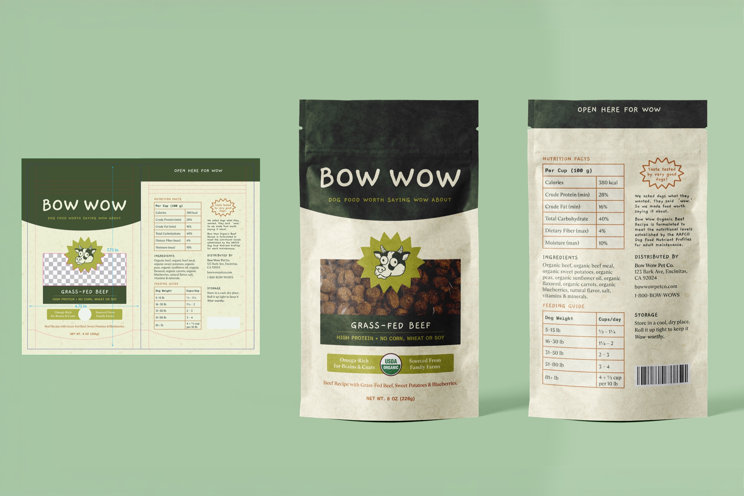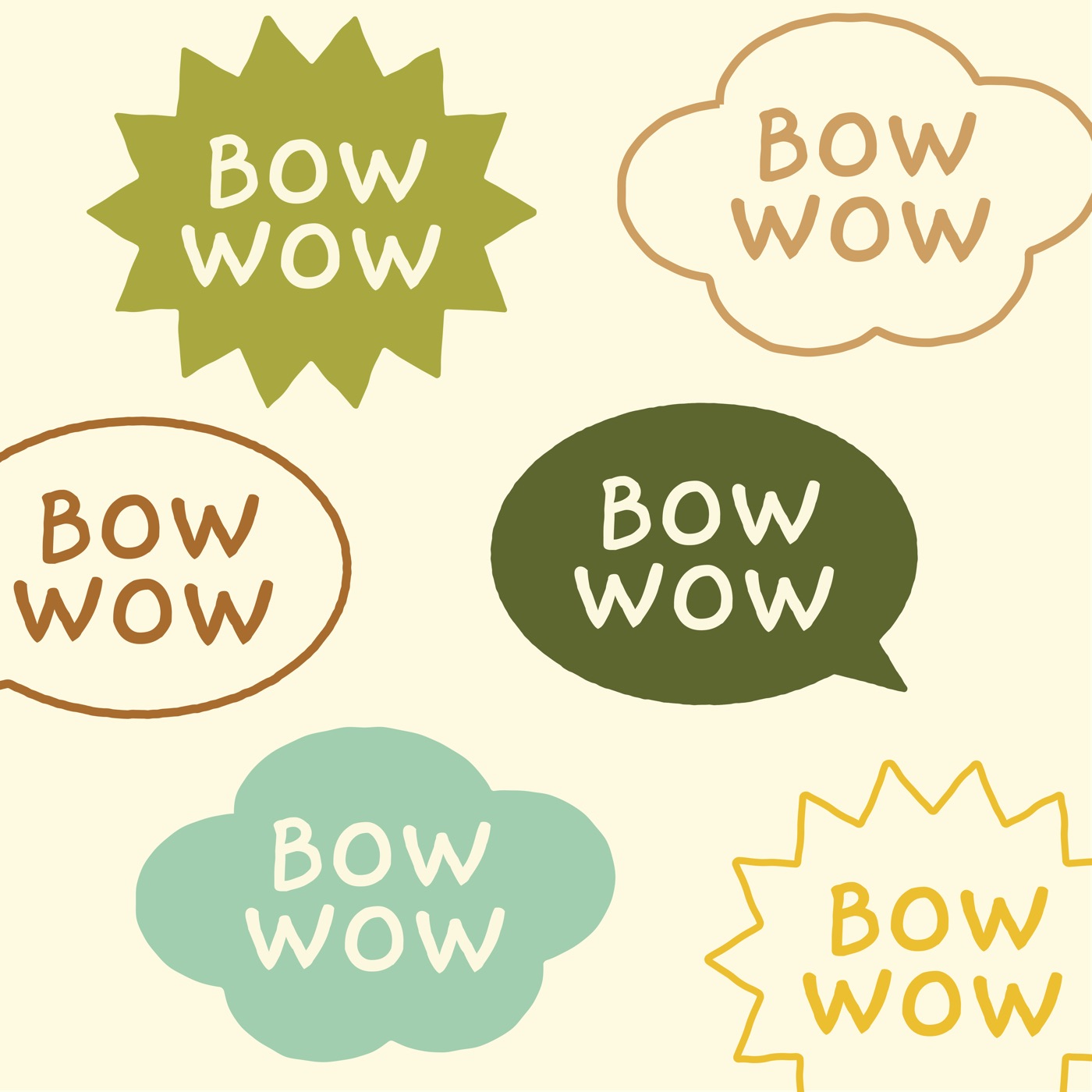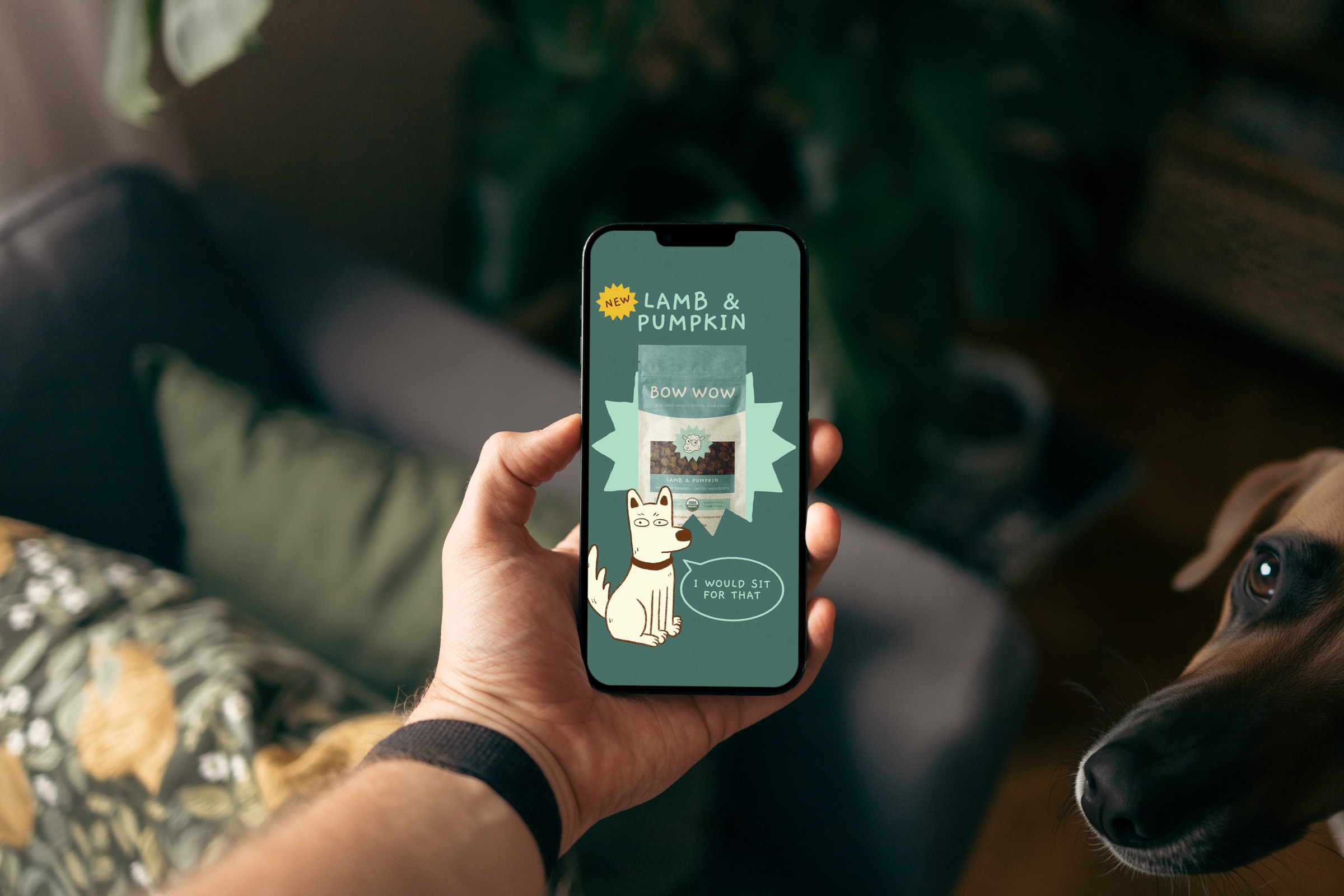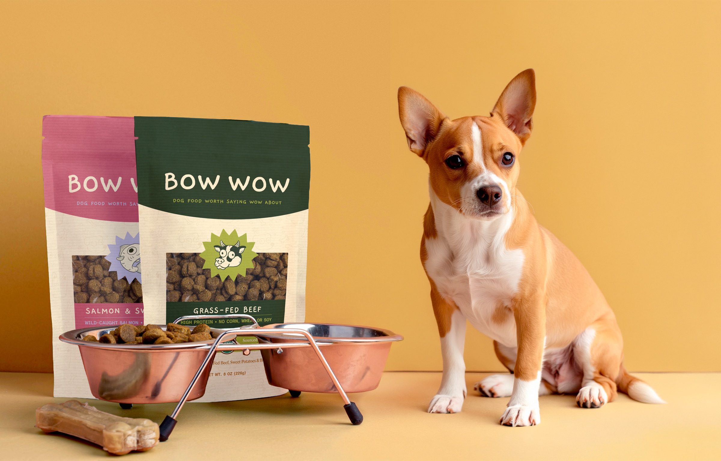
The idea at the heart of Bow Wow is giving dogs a voice. Hopefully they’re saying “Bow Wow!” at every meal. The logo lives in speech bubbles and starbursts, and the marketing lets the dogs do the talking, like the pup on Instagram who would “sit for that.” On the shelf, I wanted the bags to be friendly and eye-catching, but also clear. Anyone who’s stood in the pet food aisle knows how hard it is to tell bags apart. So each of the four recipes, picked from the flavors you’d find in any store, gets its own color and its protein drawn inside the starburst, so you can grab the right one at a glance.
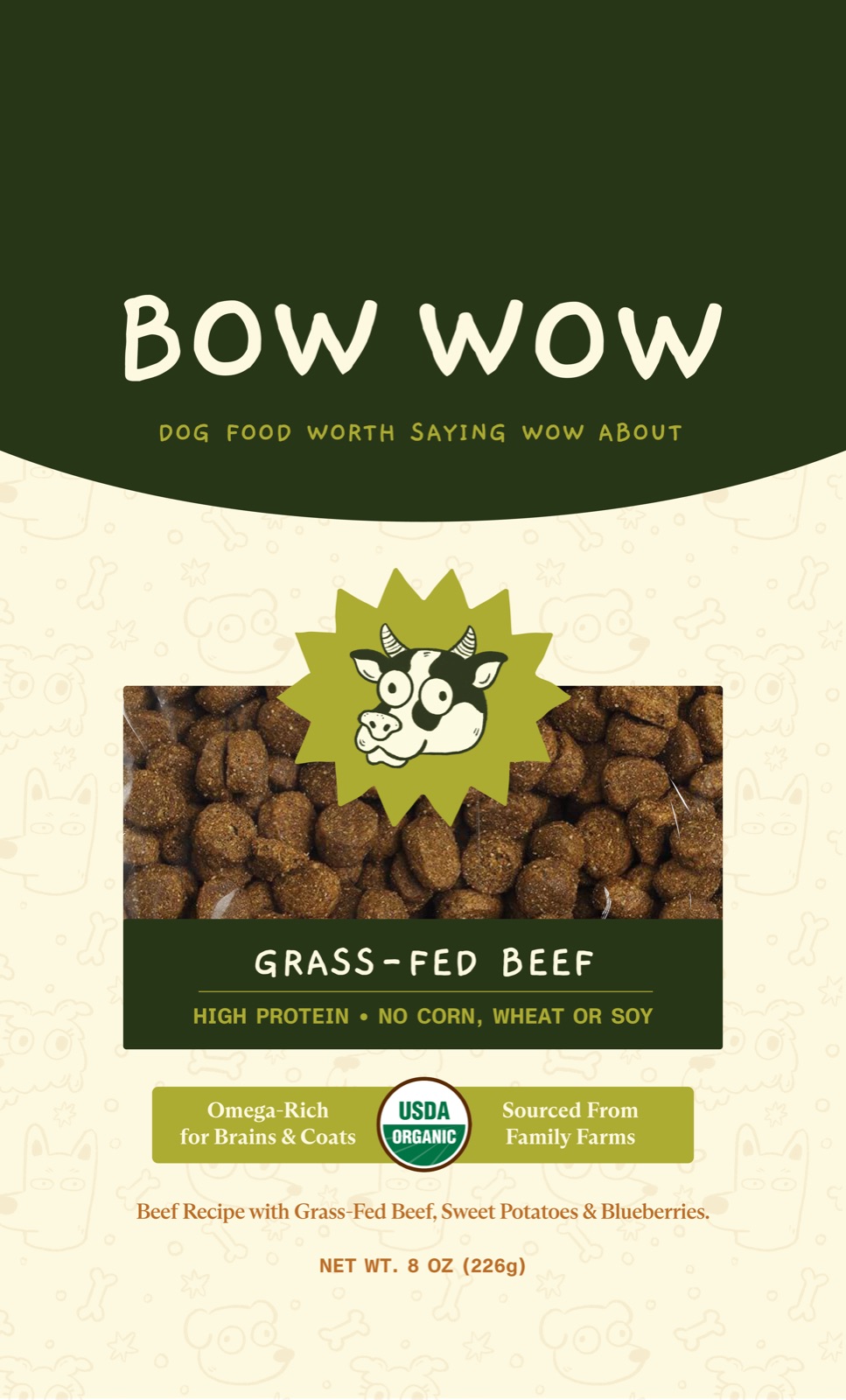
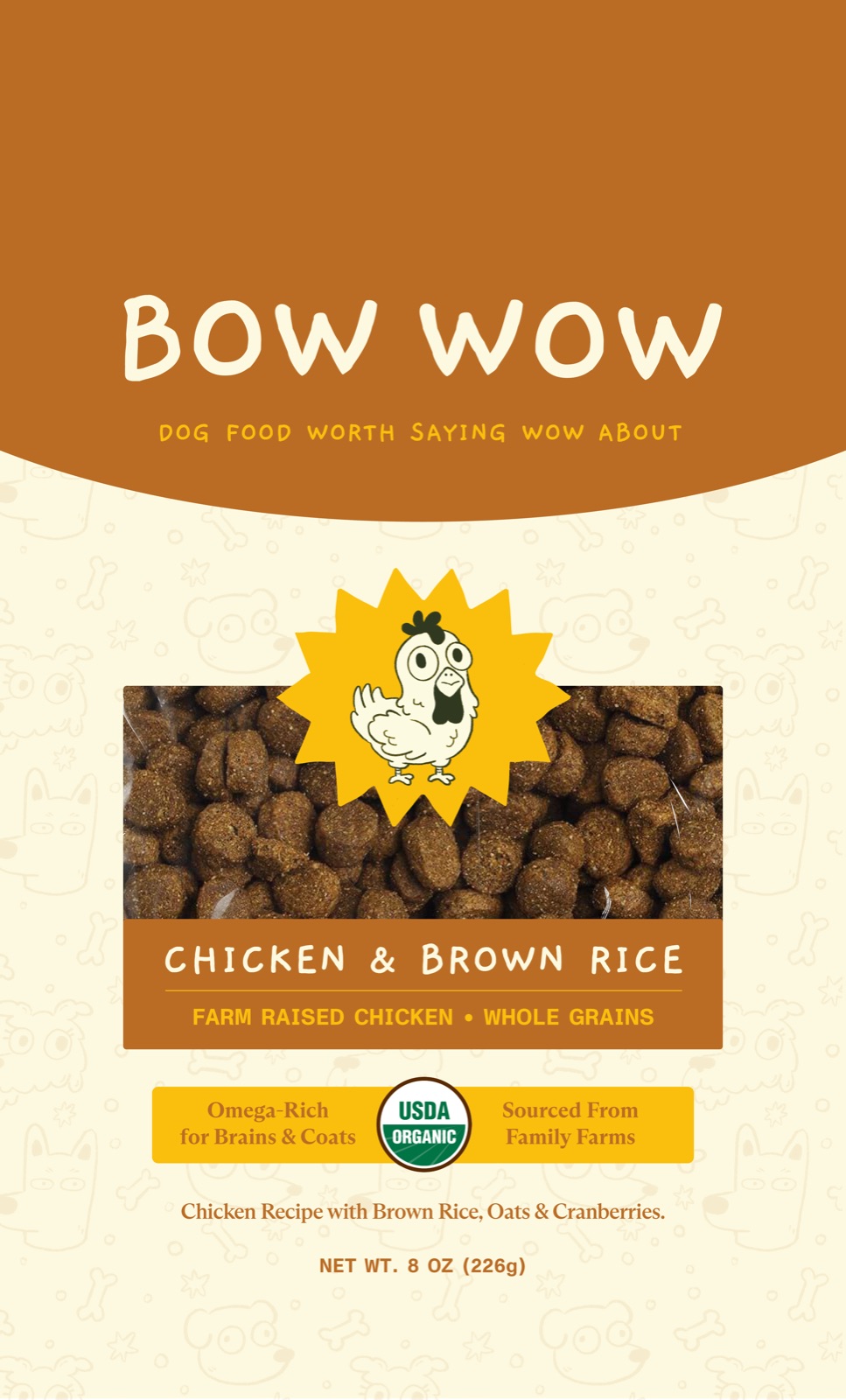
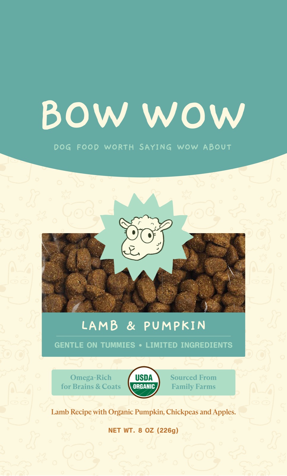
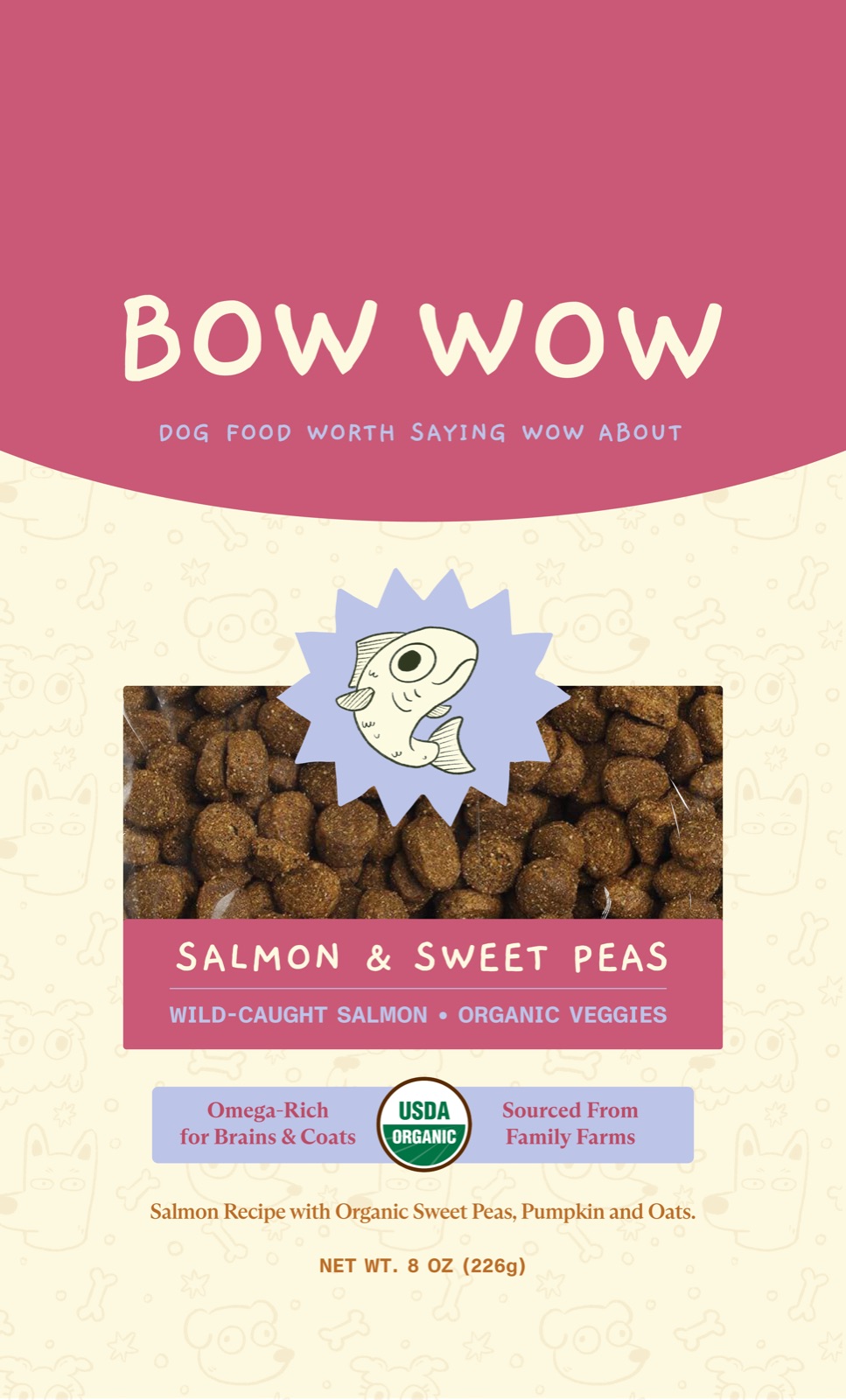
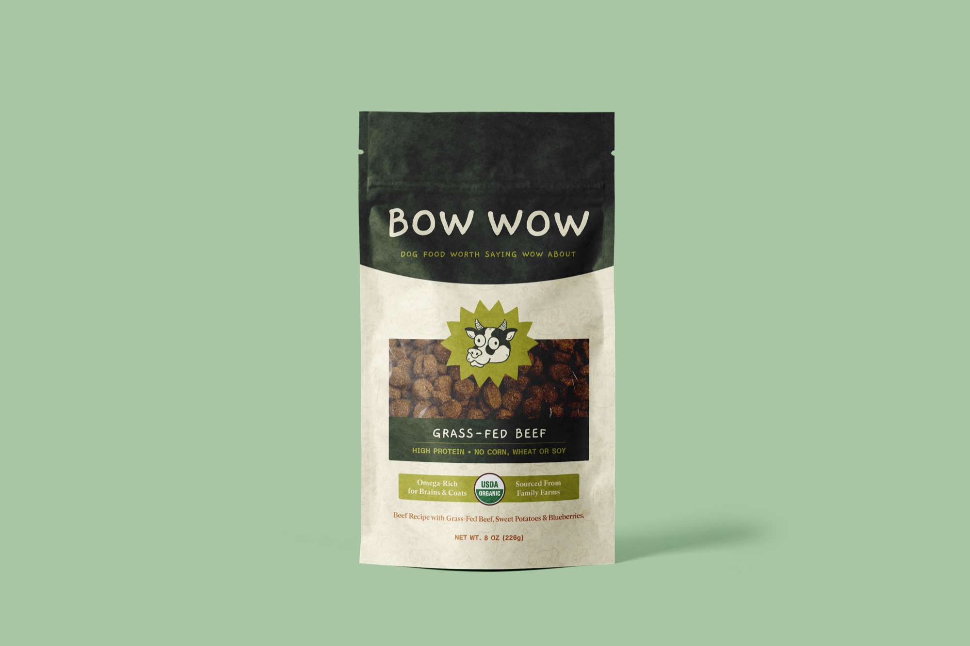
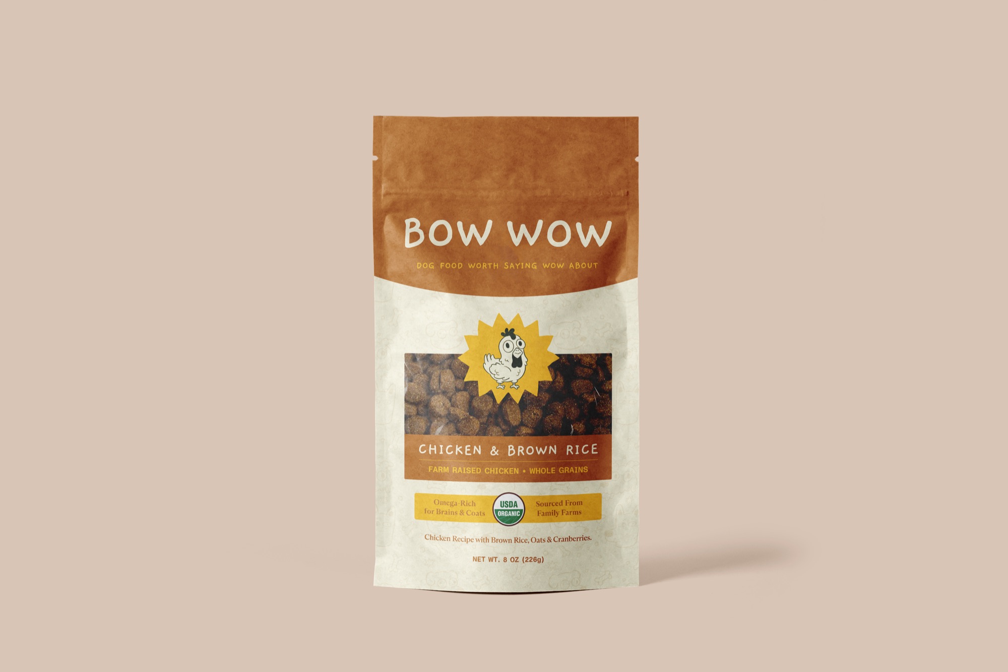
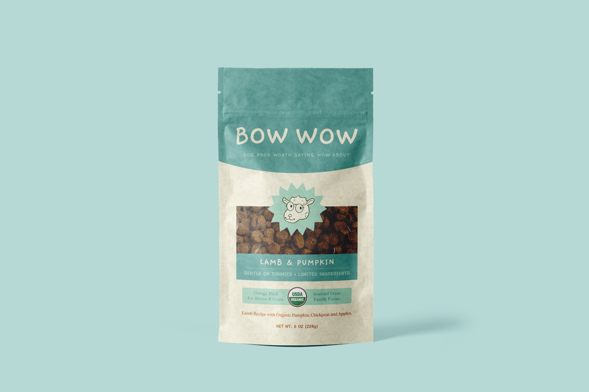
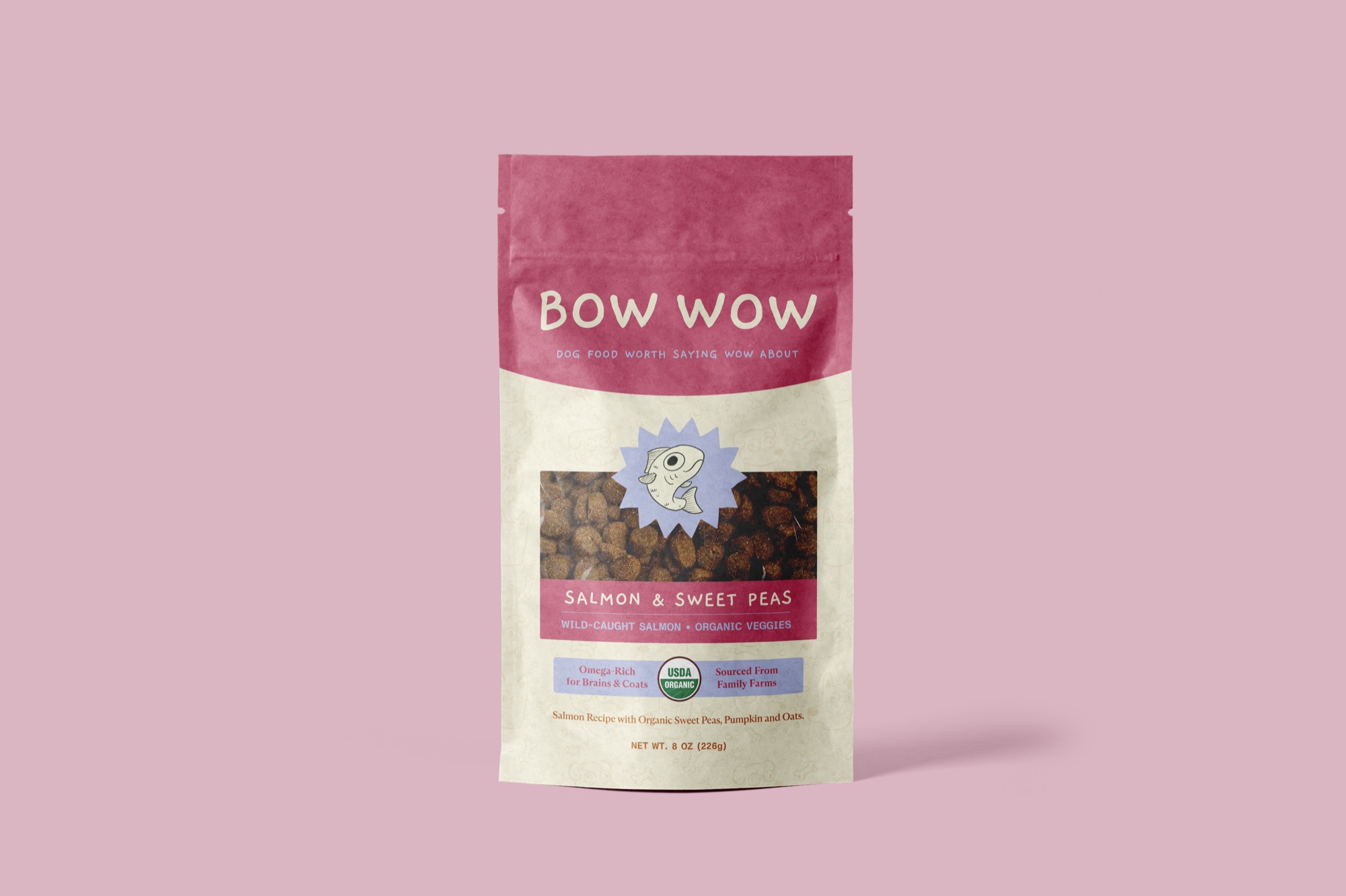
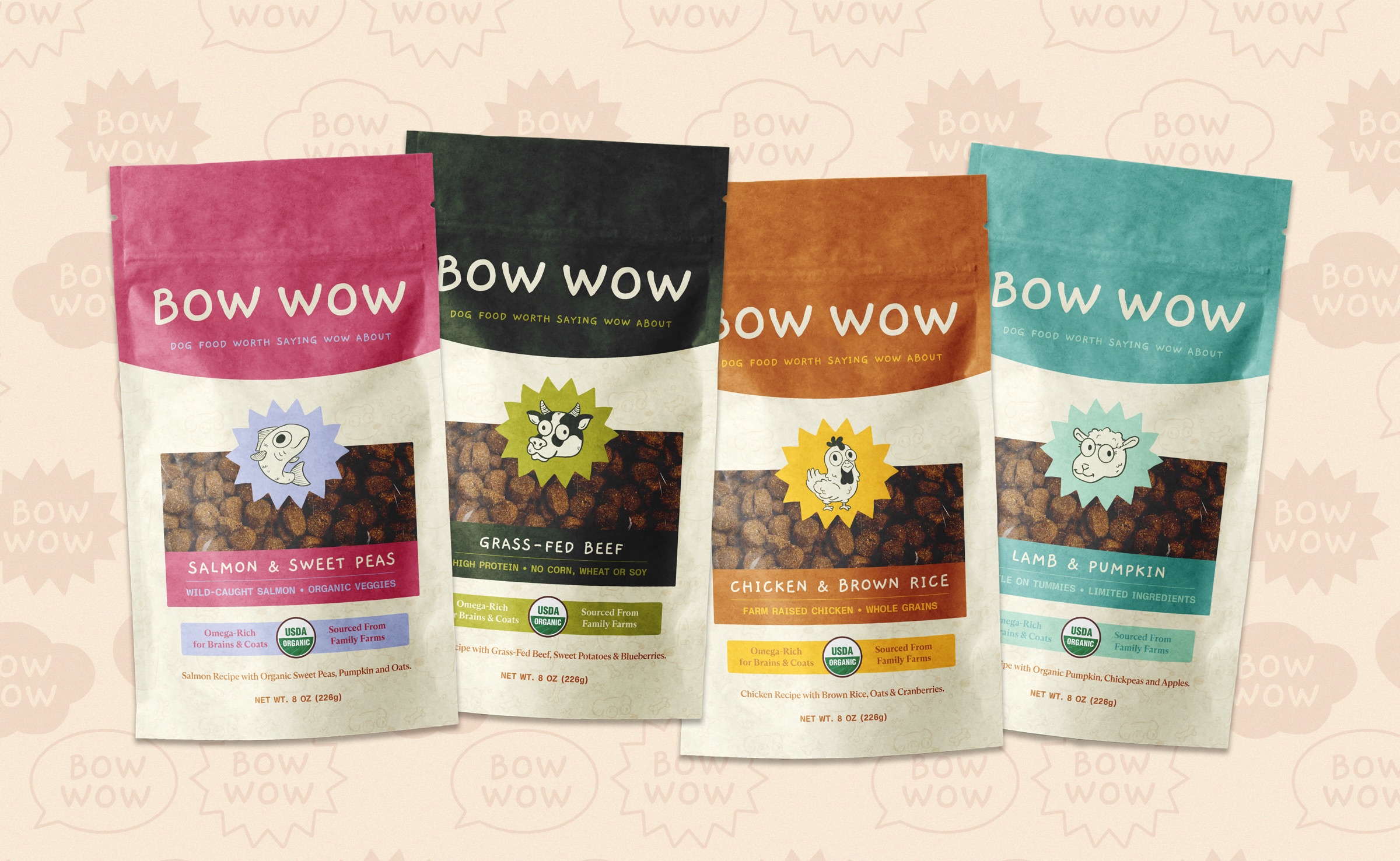
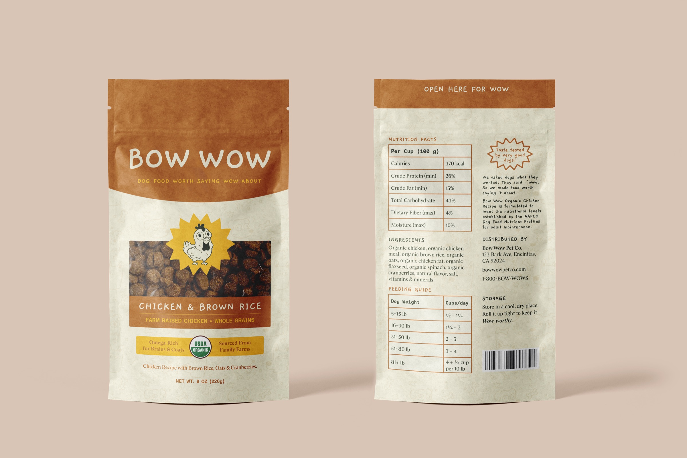
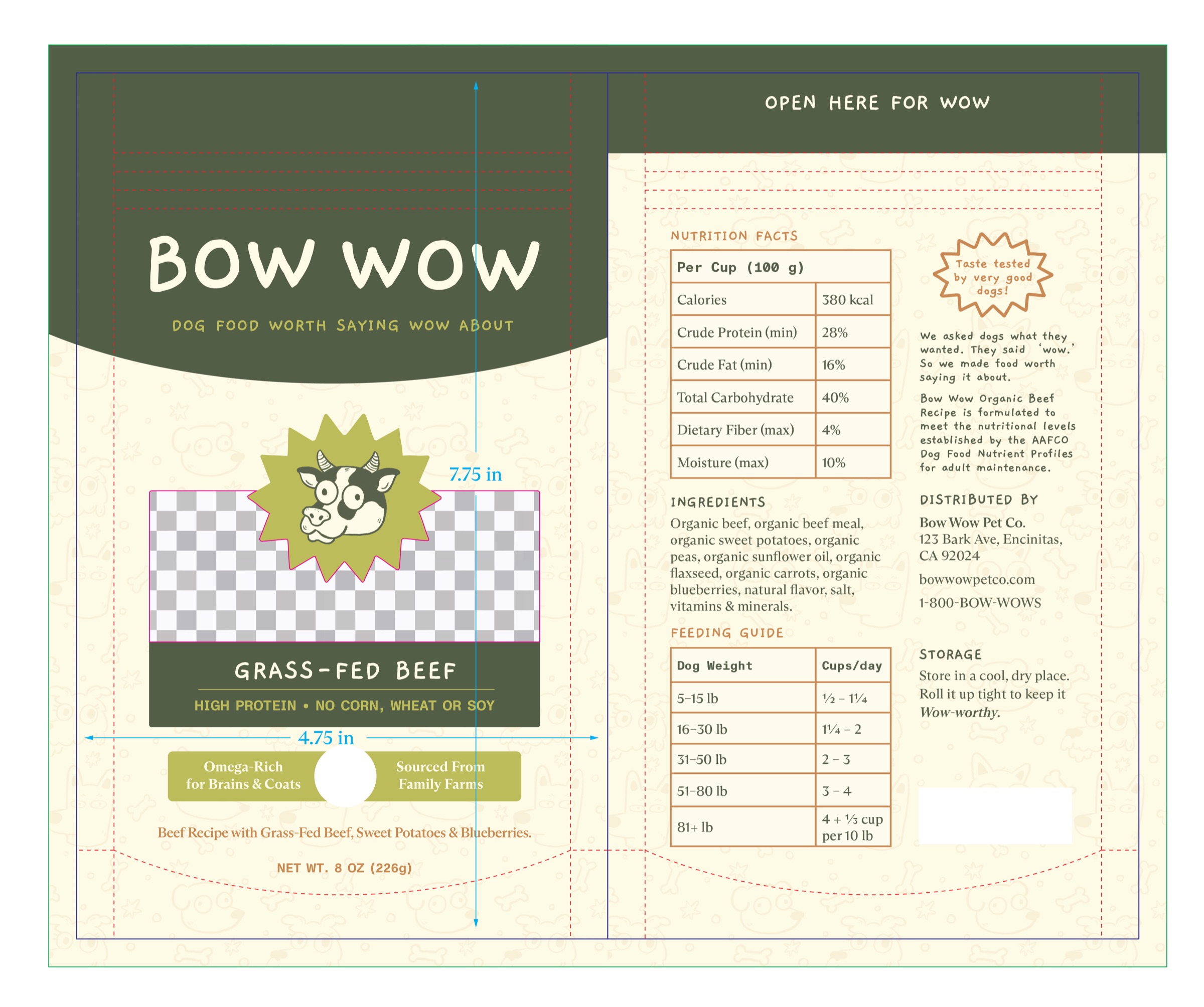
The hardest part was finding that balance of cute and clear. My first versions used vivid, saturated colors and a heavy typeface that felt too loud for the brand, so I softened both until the bags felt warm and approachable. I drew the animals in Procreate and built the rest in Illustrator. I laid out the packaging in InDesign, made the mockups in Photoshop and animated the logo in After Effects. To keep it realistic, I followed the labeling rules real dog food has to meet, from the nutrition panel and feeding guide to the AAFCO statement and USDA Organic seal, and built every bag on a print-ready dieline. Finally making a packaging product was a fun challenge, and I’m proud of how it came together.