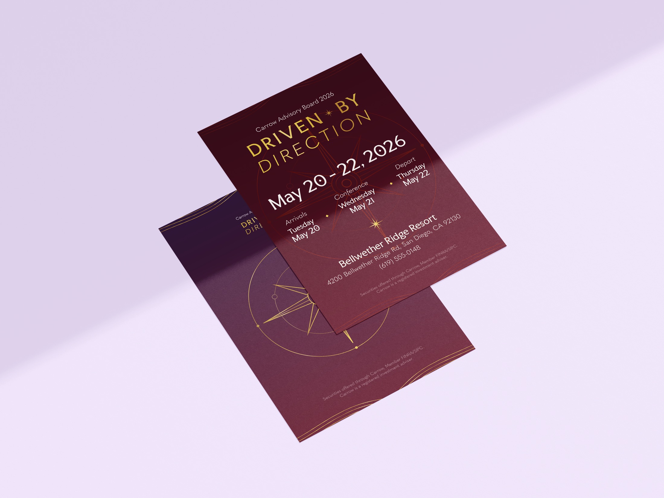
The compass came straight from the conference message. The flowing gold lines stand for the paths life takes us on: always winding and changing, but with your compass as a guide, you end up where you’re meant to be. Deep burgundy marked a milestone anniversary for the company that year, and it felt right for a journey into the unknown.
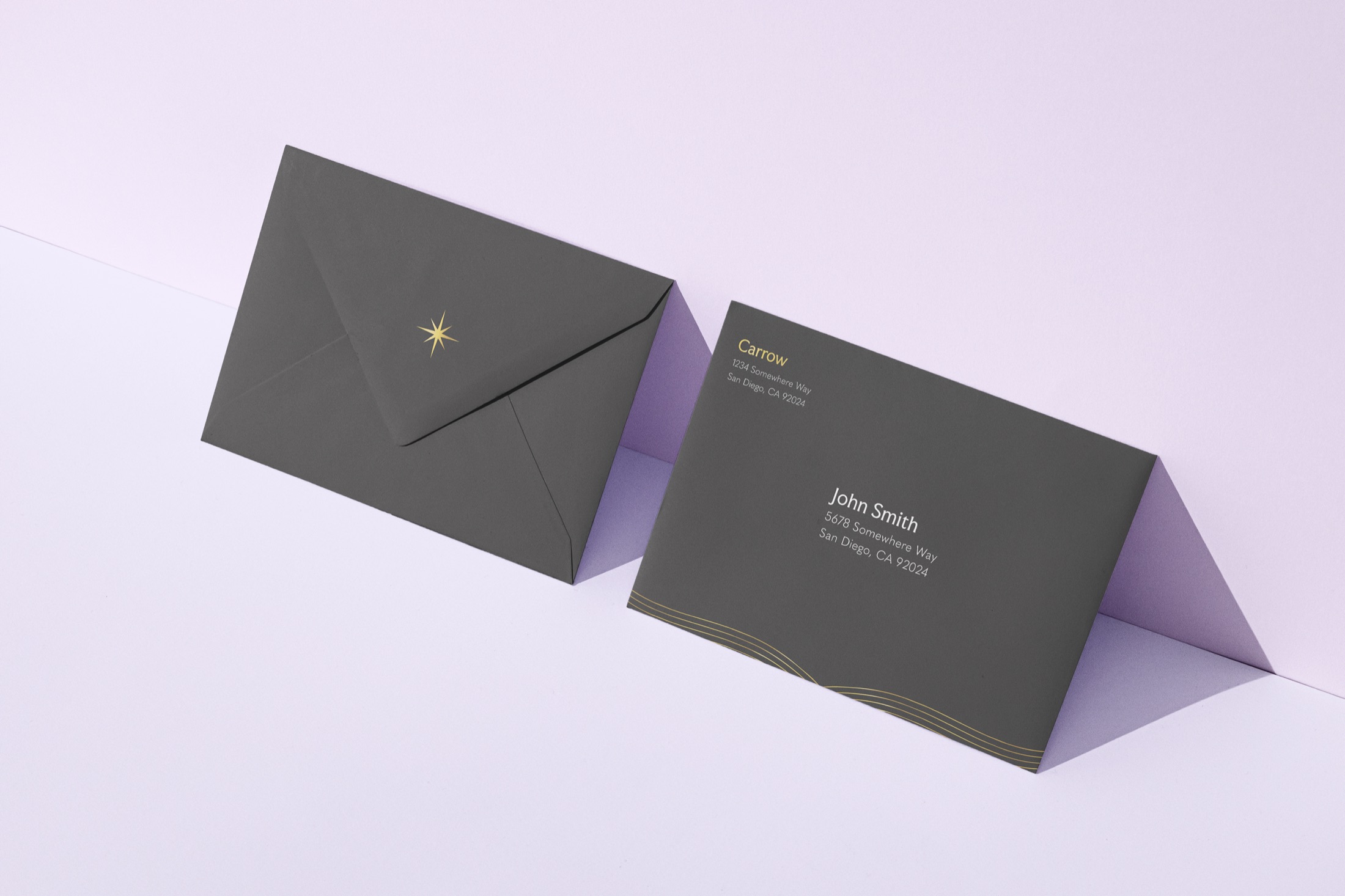
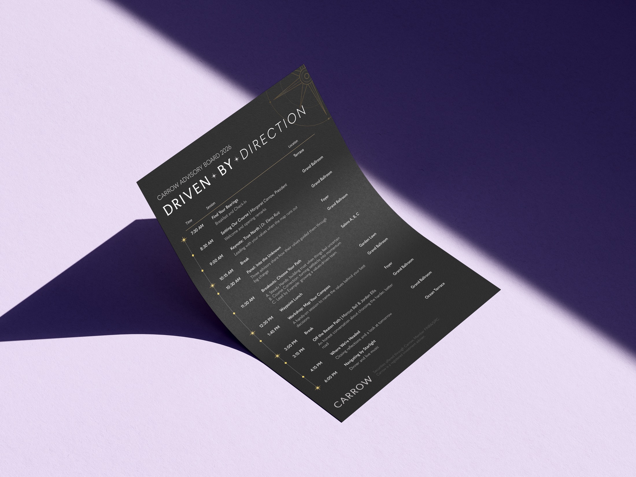
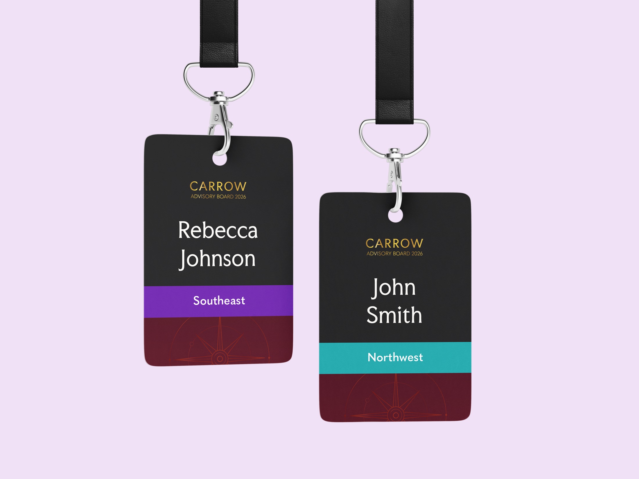
Over five months, alongside my day-to-day design work, I partnered with a second designer and our copywriter to bring the identity to invitations, envelopes, the agenda, name badges, the event website and the stage screens. The hardest part was compliance. Every piece had to pass review and follow strict brand guidelines, down to the disclosure at the bottom of each page, so the challenge was keeping the look warm and modern within those rules.
On stage, the compass came to life. I animated the opening sequence, the theme reveal, the standby loop, the speaker introductions and the intermission countdown in After Effects. During the conference, I directed the graphics from the back of the room and walked the hotel’s AV team through the run of show, so every cue landed on time.
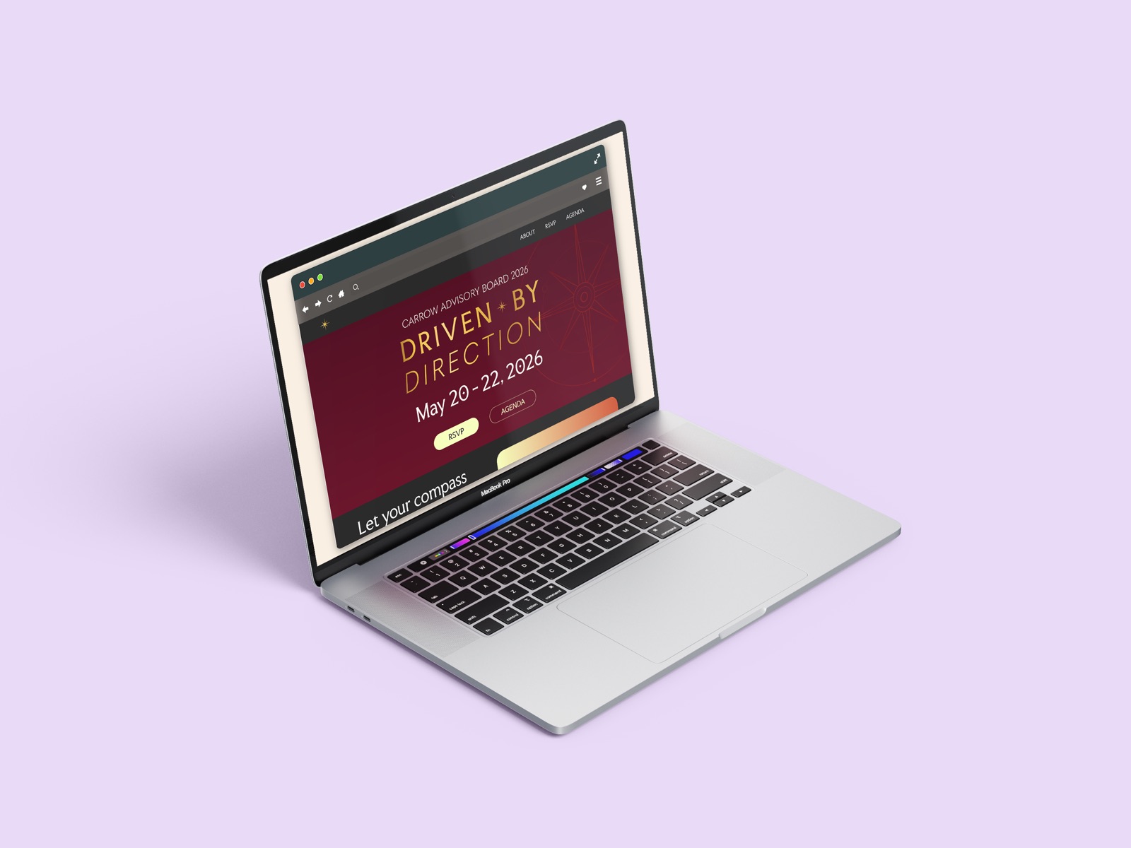
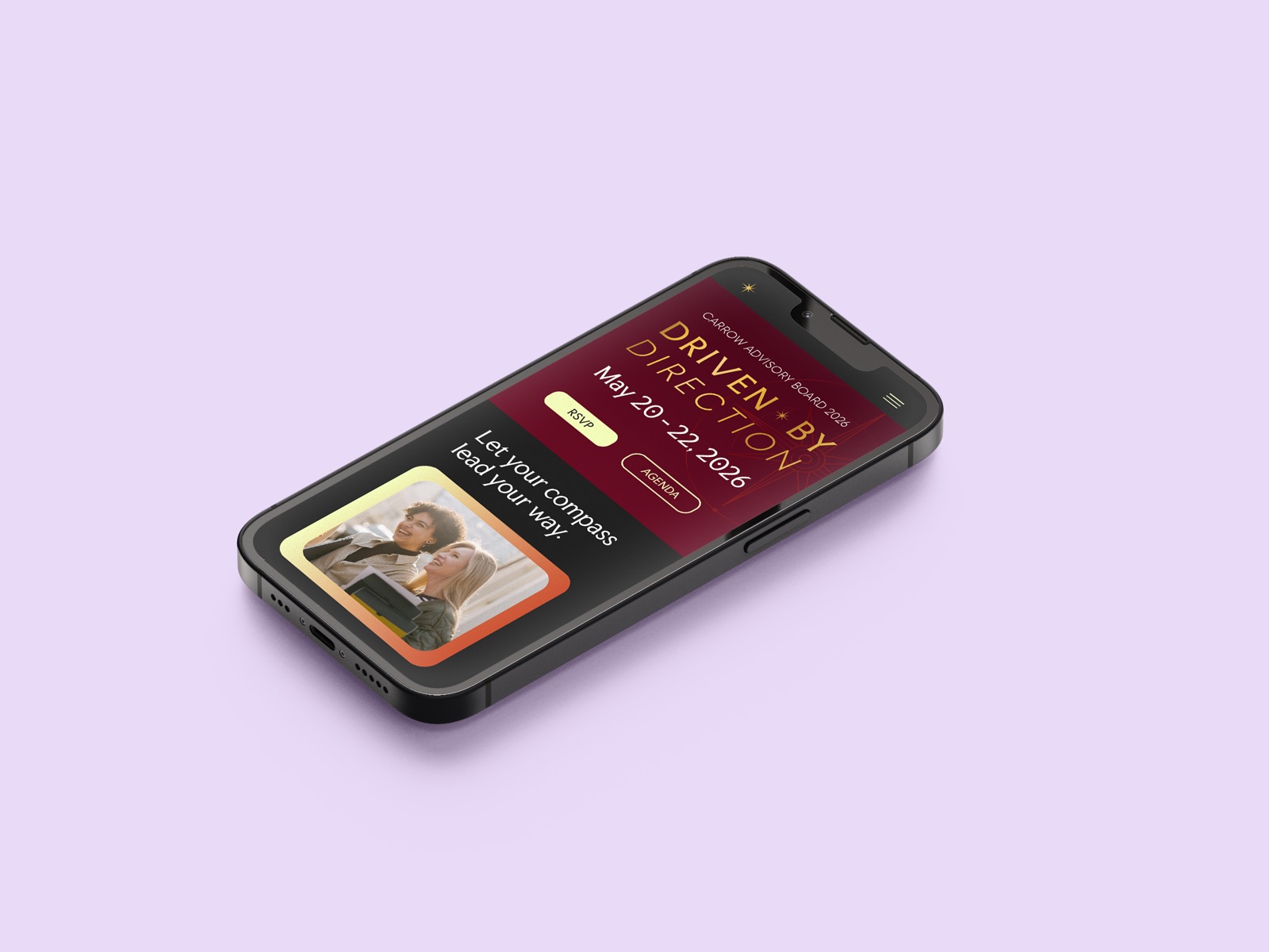
The event website gave advisors one place to RSVP and check the agenda, with the same burgundy and gold carrying from desktop to phone.
Several attendees told us it was the best Advisory Board they’d been to. Carrow is a fictional brand. Everything from the original campaign was made for broker-dealer use only, so I recreated it under a new name to share it here.