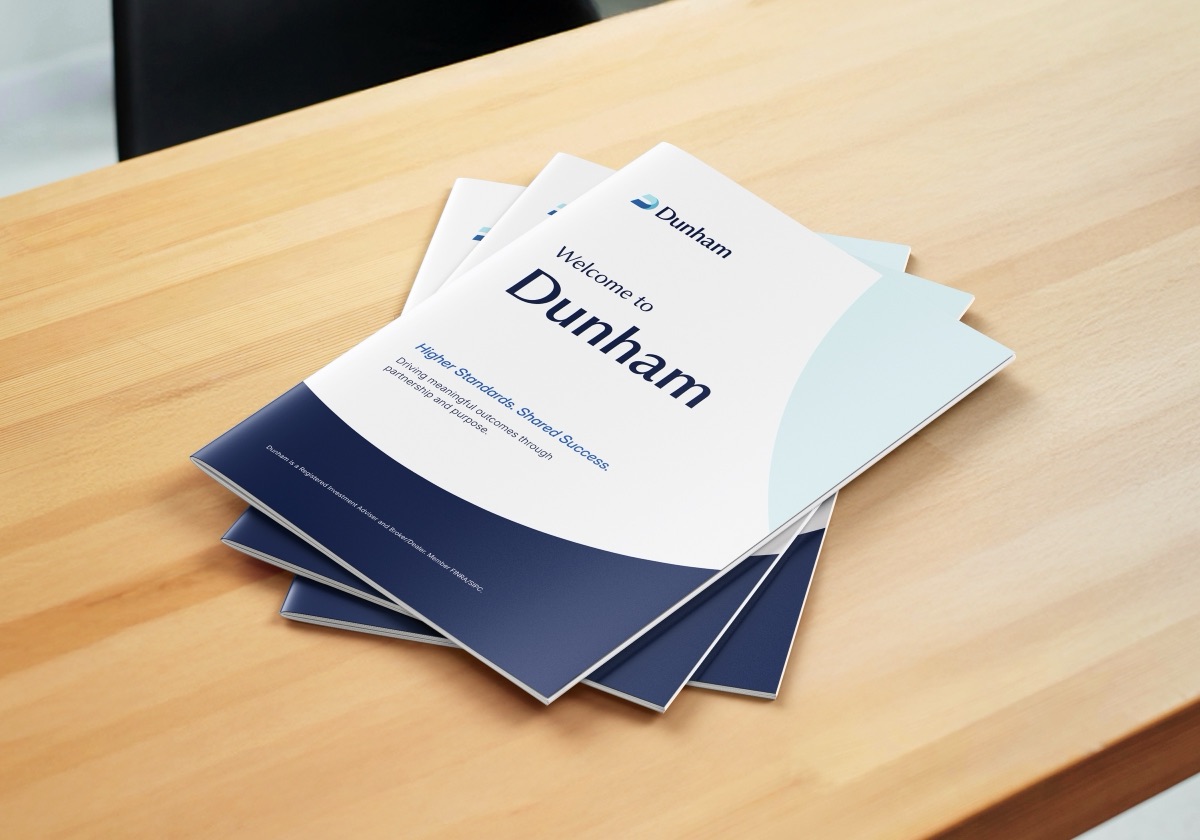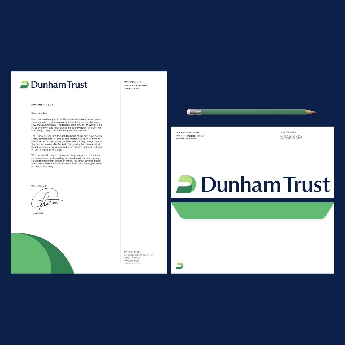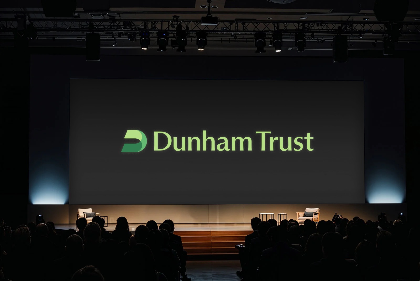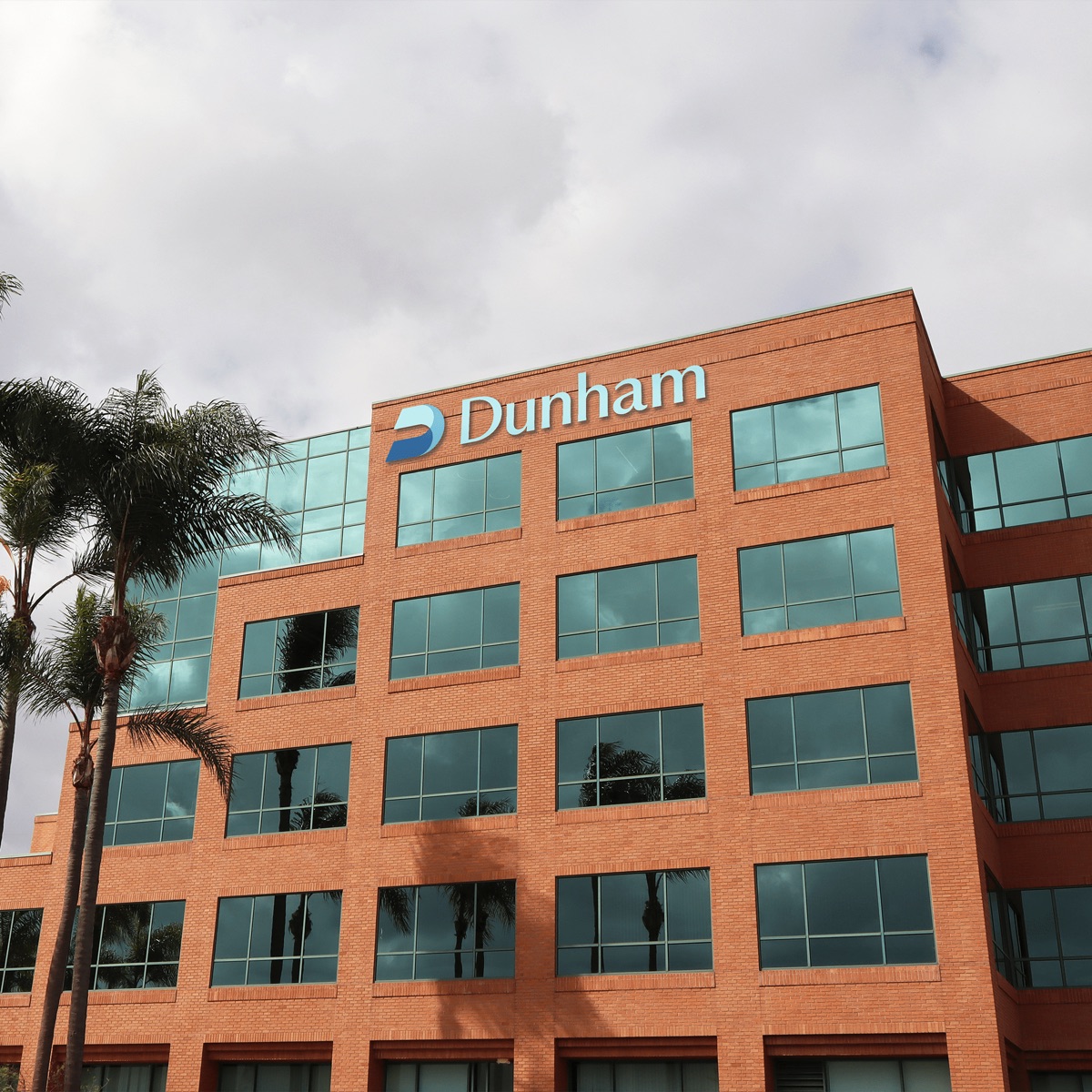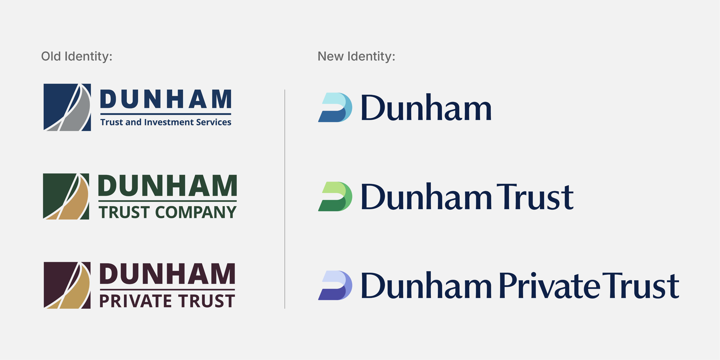
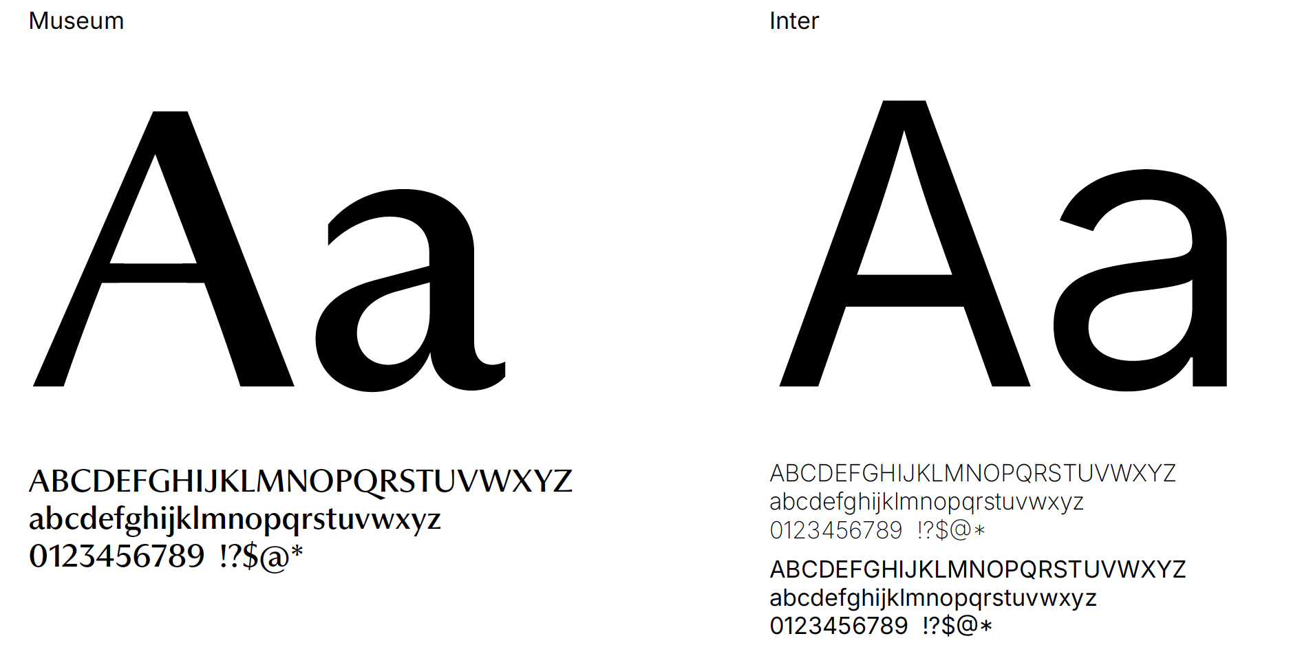
The new mark, the Double Helix, is two interwoven planes forming a forward-leaning D: a nod to the advisor roots in Dunham’s DNA (founder Jeffrey Dunham began as a financial advisor himself) and to three companies working as one. Every company shares that icon and the same typefaces, PP Museum and Inter, with its own color: blue for Dunham’s trust and stability, green for Dunham Trust’s growth, and purple for the high-net-worth clients Dunham Private Trust serves.
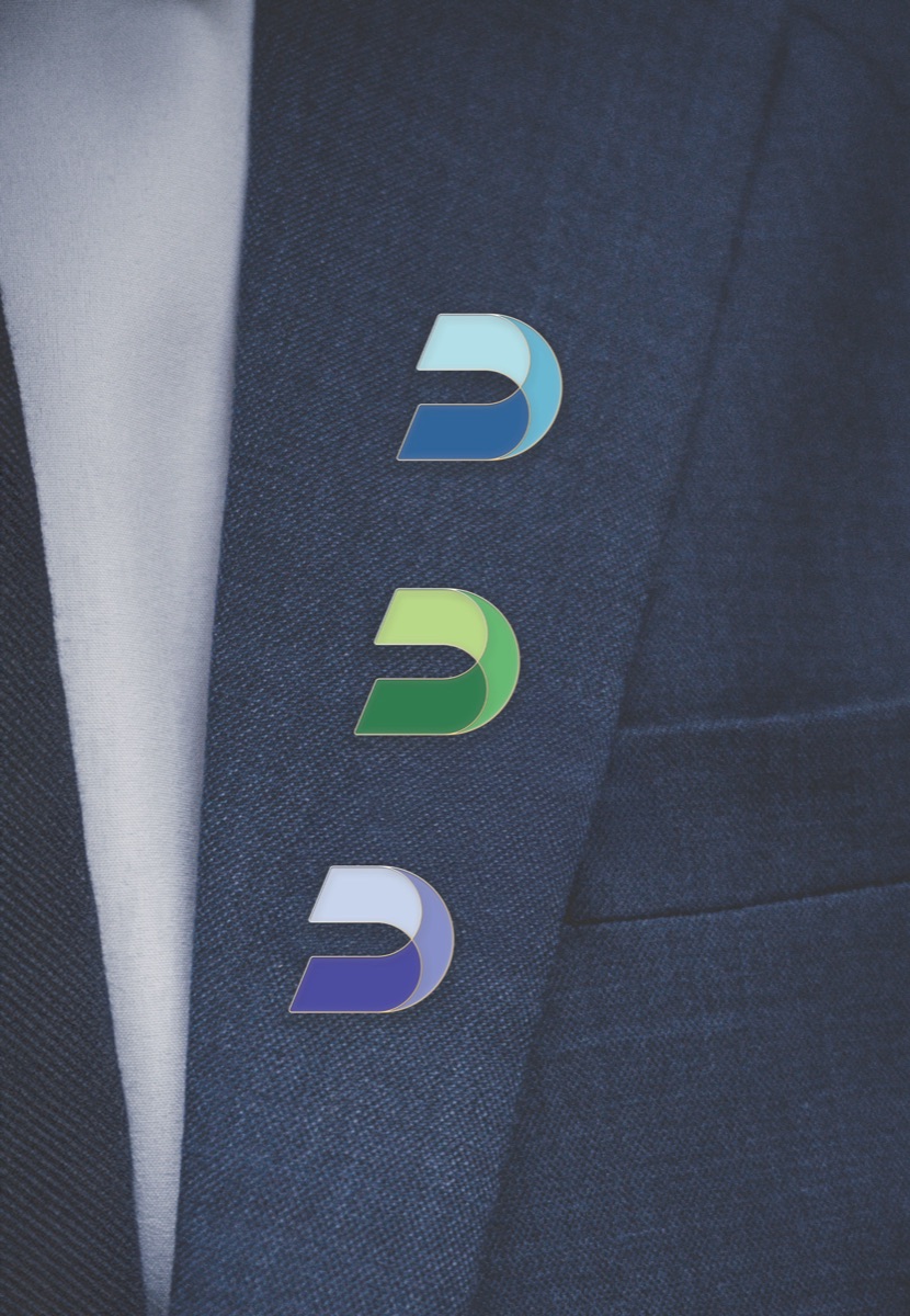
Our team of two designed the rebrand entirely in-house, while keeping up with our day-to-day work as brand strategists and graphic designers. Together we developed the mark and color system. I built out each company’s identity and helped design the new Dunham website. I also carried the brand across brochures, presentations, factsheets and event graphics, and animated the logos myself. We worked through strict compliance reviews and many leadership opinions to get there. The rebrand is now live and has been well received by leadership and clients. Seeing it through taught me how to build consensus and keep a brand consistent under tight constraints.